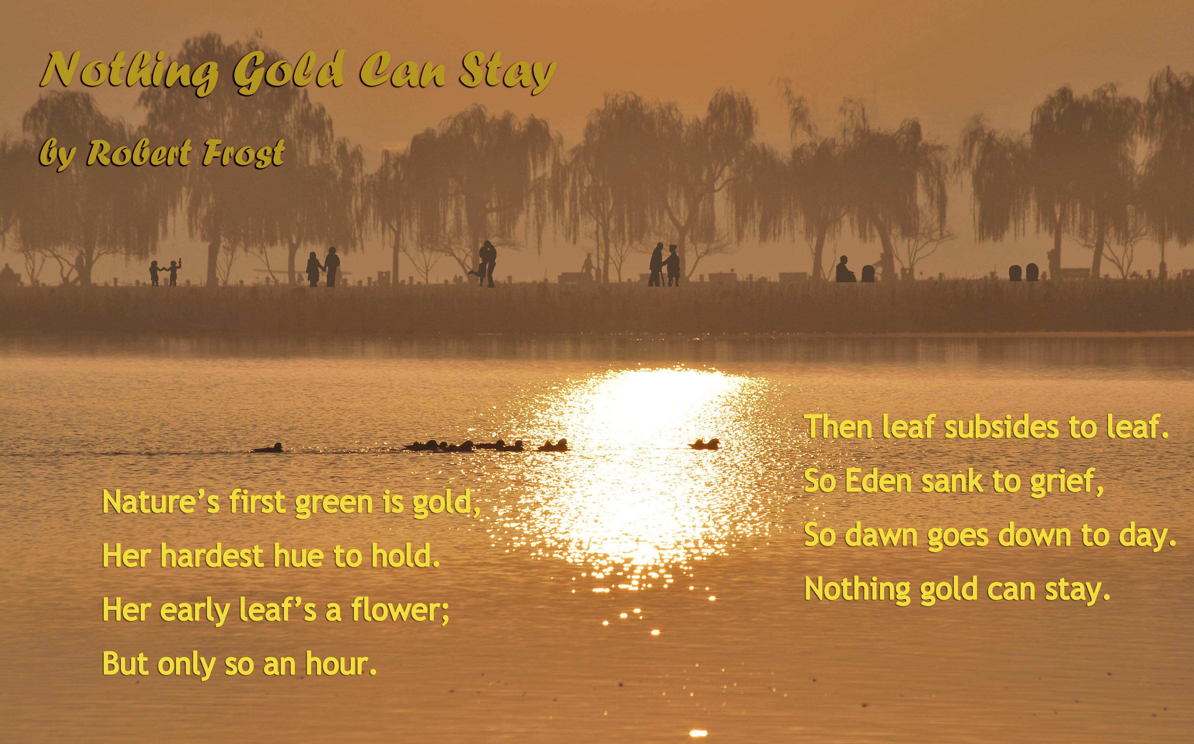
This is Caleb’s proposal.
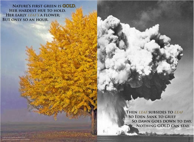
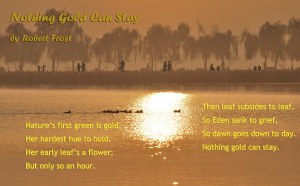
Nothing Gold Can Stay
by Robert Frost
Nature’s first green is gold,
Her hardest hue to hold.
Her early leaf’s a flower;
But only so an hour.
Then leaf subsides to leaf.
So Eden sank to grief,
So dawn goes down to day.
Nothing gold can stay.
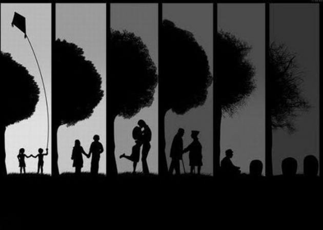
I think that this poem by Robert Frost would be an excellent choice for our group to do a poster about. It is one of Frost’s less famous poems, and I think it’s a shame that not very many people know about it. It is very short and simple, but delivers a powerful message about life. It is most definitely of literary merit, as many critics regard this as one of the greatest poems about the finite nature of life. It describes how fleeting life is, and that nothing lasts forever. I think that an effective way to portray this poem on a poster would be to use an image of Adam and Eve in the Garden of Eden, which is mentioned in the poem. We could highlight the fall of man and how this perfect place was corrupted; nothing gold can stay. The audience for the poster would be anybody older than a child that can grasp the concept of life and death. It will most likely be college-age students. I want our poster to stop and make people think about what they are doing. Is it really worth using up precious time on something that will not last forever? Is it really worth ‘wasting’ time building up wealth and money here in this short life we live? I think that this poem really packs a punch and gives us the potential to really change the way somebody thinks. If we presented them effectively, we could do a series of posters about how there’s more important things in life than just money; family, friends, nature, helping others, etc. I just don’t want to waste our audience’s time with a feel- good poem that doesn’t have any lasting impression.
Frost, Robert. “Nothing Gold Can Stay.” The Poetry of Robert Frost edited by Edward Connery Lathem. The Academy of American Poets, 2013. 28 February 2013 <http://www.poets.org/viewmedia.php/prmMID/19977>.
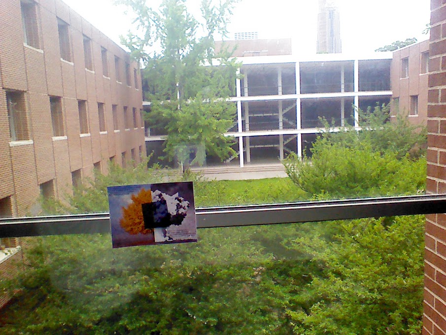
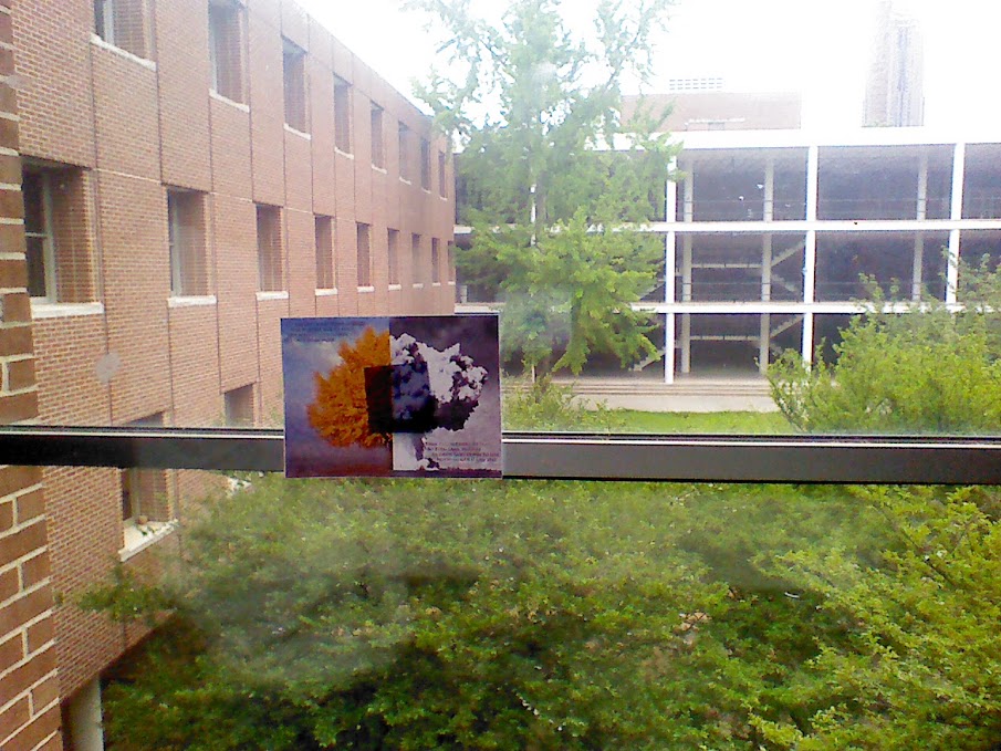
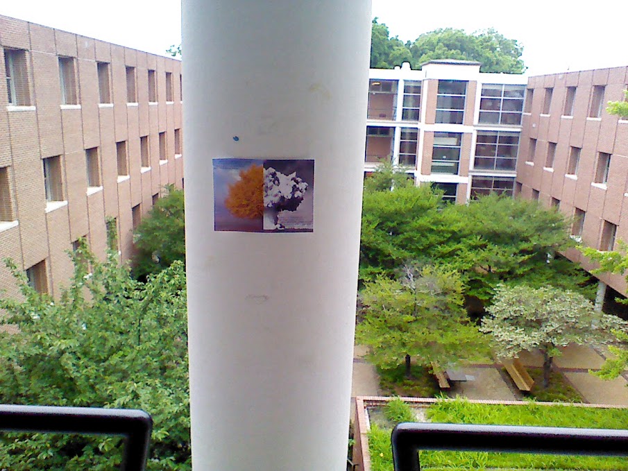
Below are two rough drafts Tianxiao and I made.
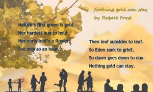
A nd the last poster is the rough design created by Wayne, Sophie and Caleb.
poster