POETRY@TECH REVIEW: MCEVER, WRIGLEY & ADDONIZIO
I really like this Poetry@Tech reading. It was very different from the poetry reading events I attended before. The three poets all had their own personalities. The first poet, Bruce McEver, was exotic. His poems about China gave me a brand new feeling of China, and let me know what China is like in the eyes of western people. However, he lacked connection with the audience. His reading was not engaging enough as well. He wasn’t skilled in presenting the poems and made me felt like he was simply reading the poems. The second poet, Robert Wrigley, was the best among the three readers in my opinion. His poems were beautiful and amazing. I was especially moved by the one in which he wrote about the forest. The whole poem was so pictorial that I could almost see the scenes depicted in the poem if I closed my eyes. He’s more skilled in presenting his poems than McEver. His confidence made his voice convincing and thus strengthened the poems’ impact on the audience. He didn’t make many pauses during his recitation. Usually I’d say this is not good because this doesn’t allow the audience to think and appreciate the poems. However, this rule obviously didn’t fit in Wrigley’s recitation. The lack of intervals created continuity for the recitation of his poems. I would say Wrigley wisely chose the recitation mode that fitted his works best. He was also good at bringing jokes into his work so that the audience didn’t feel boring. The last poet, Kim Addonizi was definitely the most impressing one. Her harmonica won her the audience’s attention and favor. It was very creative and effective to reveal her emotions in the poems utilizing harmonica. Addonizi was also a quite emotive reciter. She mastered her pace and tone during her recitation. Overall, I really had a good time at the reading and will go to the readings next year.
“Second Recitation” Proposal
For the second poetry recitation, Tianxiao and I decide to cooperate on this project. Since we are both Chinese, we hope to spread Chinese culture and be unique among all the creations by our classmates. We are planning to recite the famous poem “Bring in the Wine” by one of the greatest poets in China’s history, Li Bai.
This poem is basically a poem that tries to persuade a friend to drink more wine on a party. However, the poem would not become one of Li Bai’s greatest works if it’s only about wine. Li Bai expressed his concerns about time and life in this poem. His unconventional and mostly-positive thoughts are quite optimistic and encouraging. However, the poem was actually written when he’s experiencing a career failure. We can still sense some disappointment in it.
This is a poem full of imposing atmosphere and exquisite emotions. If we only recite it, the strong emotion and atmosphere in it could not be released. 1. So we will combine visual and auditory aspects. We are going to find music tracks and videos about poem. We are still considering about whether we will record our recitation of the poem and mix it with the music and videos. Reading it loud makes more sense, but recording may perform better than a live show. 2. We find an English translation for “Bring in the Wine”. However, this version has some flaws that could be improved. We choose to revise the translation by ourselves. It’s a bold but also fruitful, if it works well, decision. 3. Although the poem has been translated, the immense difference in culture makes our artifact hard to be understood. So we will still add subtitles to the artifact, so that our audience can comprehend better in the general. 4. We are also considering in reciting the poem in Chinese. In our opinion, Chinese can express the essence of poem. And we also think emotions have no national boundaries, if we catch the point of the poem and perform it properly, our audience can comprehend. This is really a risk, since none of our audience understands Chinese.
After all, we have to focus on how to pass the ideas in the poem to our classmates. Everything should work for this purpose.
See how the Yellow River’s water move out of heaven.
Entering the ocean,never to return.
See how lovely locks in bright mirrors in high chambers,
Though silken-black at morning, have changed by night to snow.
… Oh, let a man of spirit venture where he pleases
And never tip his golden cup empty toward the moon!
Since heaven gave the talent, let it be employed!
Spin a thousand of pieces of silver, all of them come back!
Cook a sheep, kill a cow, whet the appetite,
And make me, of three hundred bowls, one long drink!
… To the old master, Tsen,
And the young scholar, Tan-chiu,
Bring in the wine!
Let your cups never rest!
Let me sing you a song!
Let your ears attend!
What are bell and drum, rare dishes and treasure?
Let me br forever drunk and never come to reason!
Sober men of olden days and sages are forgotten,
And only the great drinkers are famous for all time.
… Prince Chen paid at a banquet in the Palace of
Perfection
Ten thousand coins for a cask of wine, with many a laugh and quip.
Why say, my host, that your money is gone?
Go and buy wine and we’ll drink it together!
My flower-dappled horse,
My furs worth a thousand,
Hand them to the boy to exchange for good wine,
And we’ll drown away the woes of ten thousand generation!
After discussing it with our professor, we decided to find another poem because of its long length and difficulty in translation and interpretation. We found a better poem called “Drinking Alone with the Moon,” which is also by the same author Li Bai. This poem was much shorter and easier to interpret. However, the English translations we googled were not very helpful, but our native Chinese speaking group members and I were able to make a very well thought-out translation. We focused a lot of time on writing this translation because even though this is a very famous Chinese poem, it is still crucial for our English speaking audience to appreciate it in the same manner. In order to keep the authenticity of the poem, we decided to narrate the poem in Chinese but also have English subtitles and to use Chinese (or just meditative) music to match the mood of the poem. We then made a storyboard of what to film. After exploring different ways of interpreting our poem, we decided the video would be about the life a Georgia Tech student and his struggle with studying and procrastination. The video would include both a reality state, in which he is always studying and drinking coffee, and a dream state, in which he falls asleep or daydreams of what it is like to live life ( I have marked these places in the poem below). To make the video more interesting, we decided to differentiate between these two states by filming the student in the reality state and then create animated drawings to represent the dream state.Drinking Alone with the Moon.
(REALITY)
From a pot of wine among the flowers
I drank alone. There was no one with me –
(IMAGINARY) Till, raising my cup, I invited the bright moon
To bring me my shadow and make us three.
(REALITY) Alas, the moon was unable to drink
And my shadow tagged along with me vacantly;
(IMAGINARY) But still, for a while, I had these friends
To cheer me until the end of spring….
I sang. The moon encouraged me.
I danced. My shadow tumbled after.
And for as long as I knew, we were joyful companions.
(REALITY)
Then I realized I was drunk, and we lost one another.
Poetry Poster Final Draft
Around campus:
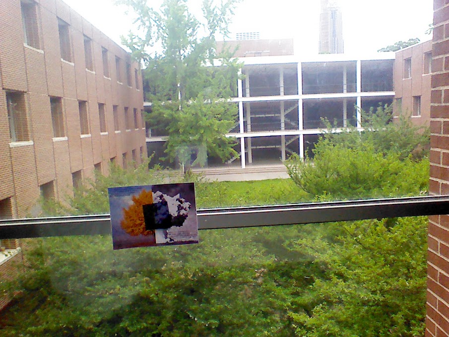
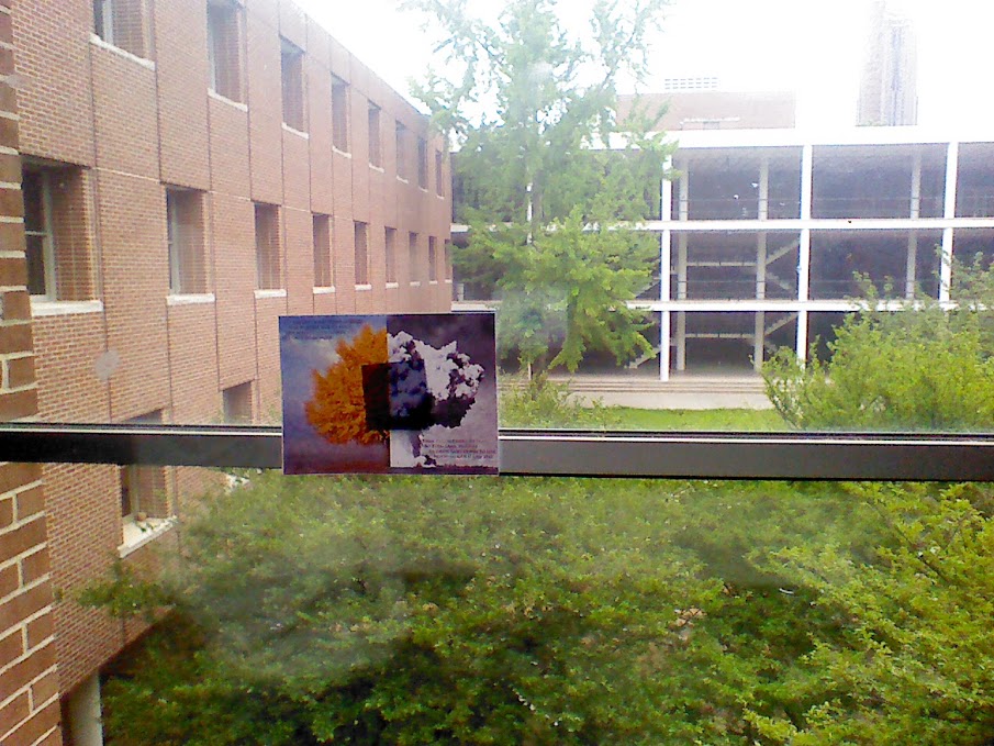
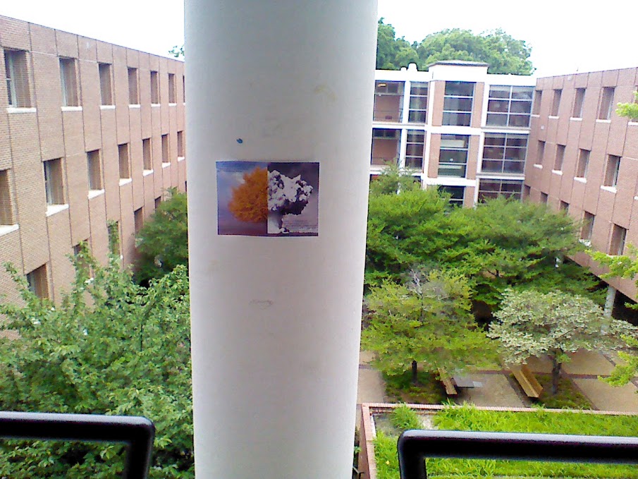
Wayne opted to put up the poster at two locations around Skiles which overlook the central courtyard. Having worked in Skiles almost daily for over a year now, I have had the opportunity to see the courtyard complete a full cycle through its seasons, from the bright green of spring to the dead branches of winter. I have also seen the longevity of papers posted up around Skiles, so it is my hope that at least one of the posters will survive long enough so that those who see them regularly will also see the changing of the seasons, especially the coming of autumn and winter as the leaves fall away.

Reflection on “Poetry Poster”
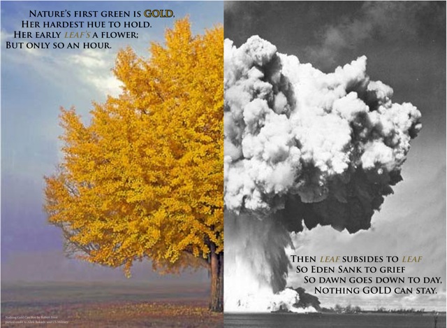
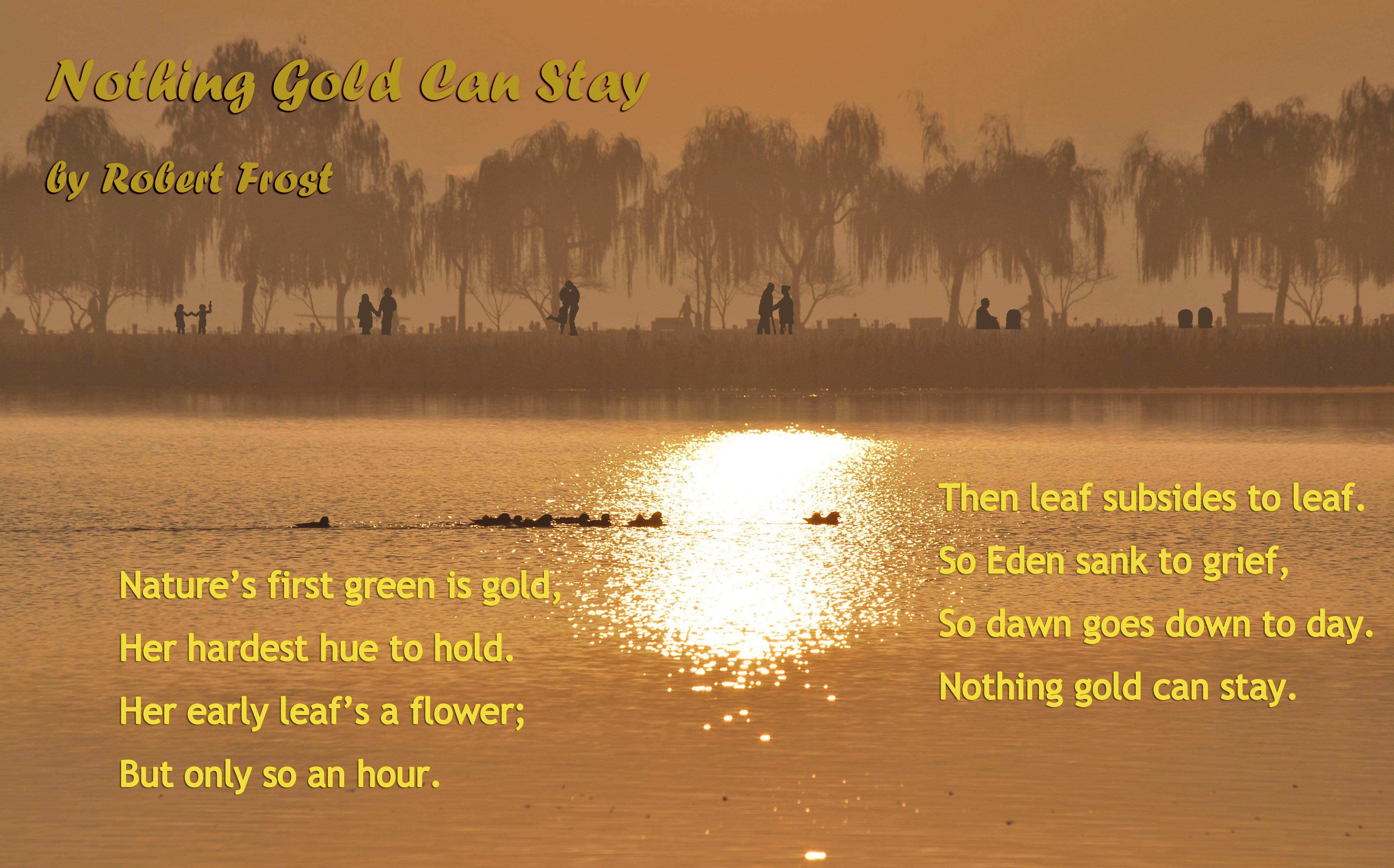
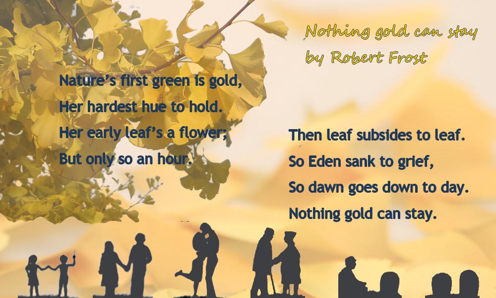
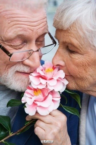
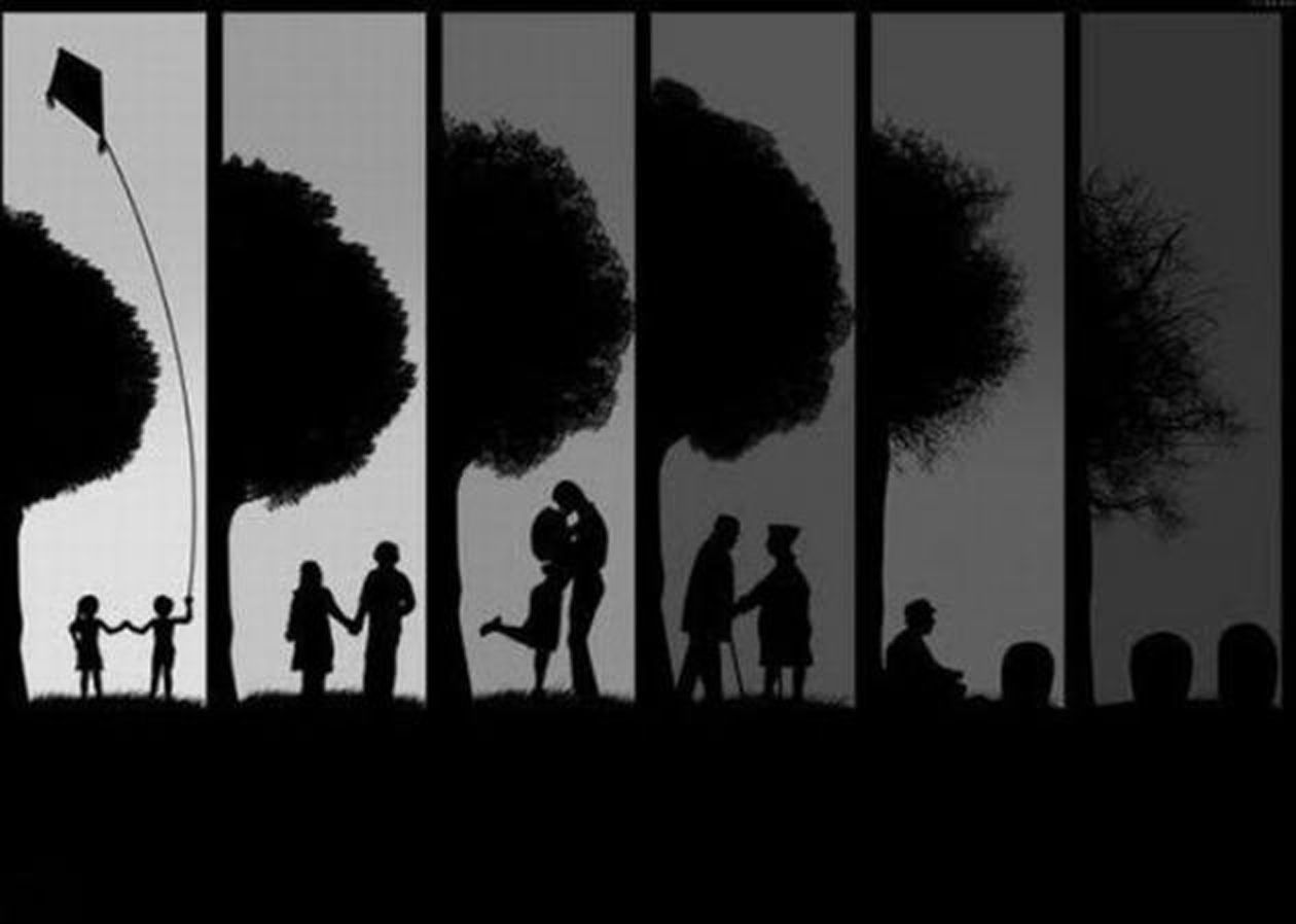
1. On the poetry poster project, we had two versions of first draft since we have very different ideas about how to make the poster. So Tianxiao and I designed a poster that is totally different from the final draft. The title of the poem is “Nothing Gold Can Stay” and the content of the poem mentioned nature, flower and leaf. So we focused on an natural expression of pass of time. We used a series of picture about how a couple change from the youth to their death, which is a kind of unavoidable and natural expression of pass of time. The final draft was a picture of combination of a real tree and a tree-looking bomb cloud. Its conception is much more eye-catching than the first draft done by Tianxiao and I. The combination of the tree and the bomb cloud showed the coexistence of beauty and destruction. At the first glance you might think it is just a picture of tree, but when you look closer, you find it’s actually a half tree and half bomb cloud. It is a astonishing design. We cut out the distracting trees behind the main tree and used the other side of the same tree in the first draft done by Wayne, Sophia and Caleb, so that it looked cleaner and more eye-catching than their first draft. We also adjusted the position of texts, added border to the word “GOLD”, and modulated color of the repeating word “LEAF” so that the texts fitted better in the background. The final draft is suitable for any kind of audience since the poster combined two kinds of most contrast things, the beauty and the destruction together, which is simple and emphsizes the theme of the poem.
2. When you firstly see our poster, you will think it is just a normal tree picture. But as you look at it carefully, you will realize that half of the picture is a huge bomb clous! Generally speaking, we used two pictures of contrast colors. The colored tree and the black-and-white bomb cloud not only caught the audience’ eyes but also emphsized the theme of the poster, “nothing gold can stay.” We did lots of photo shop to cover the distracting brances in the original tree picture. The branches in the original poster could confuse many audience. And the height of the tree and the bomb cloud was adjusted with care so that they look harmoneous. The golden leaf and the golded words “leaf” correlated with each other and their colors are match. By adjusting the text’s color, the audience see the word “Gold” and “Leaf” the first, which implied the content of the poem and poster.
3. When we were designing the poetry poster, we had two very different ideas and both seemed feasible. So we divided our group into two smaller parts and each part took charge of the display of one idea. Both parts provided a first draft. We compared the two drafts and chose one to continue working on with. The result turned out to be satisfying because we spent the same time but had two choices. And the colision of thoughts not only showed more interesting ideas but also inspired every group member to come up with important improvements to our final draft. I think I will choose to work independently at first and then combine each person’s work if we encounter an division in ideas while we work in groups. This process is worth repeating because it is efficient and really fruitful. Sometimes it just turns out to be that the result is different from anyone’s imagine and surprising.
Artifact #3: Poetry Poster Project ROUGH DRAFT
This is Caleb’s proposal.
Nothing Gold Can Stay
by Robert Frost
Nature’s first green is gold,
Her hardest hue to hold.
Her early leaf’s a flower;
But only so an hour.
Then leaf subsides to leaf.
So Eden sank to grief,
So dawn goes down to day.
Nothing gold can stay.
I think that this poem by Robert Frost would be an excellent choice for our group to do a poster about. It is one of Frost’s less famous poems, and I think it’s a shame that not very many people know about it. It is very short and simple, but delivers a powerful message about life. It is most definitely of literary merit, as many critics regard this as one of the greatest poems about the finite nature of life. It describes how fleeting life is, and that nothing lasts forever. I think that an effective way to portray this poem on a poster would be to use an image of Adam and Eve in the Garden of Eden, which is mentioned in the poem. We could highlight the fall of man and how this perfect place was corrupted; nothing gold can stay. The audience for the poster would be anybody older than a child that can grasp the concept of life and death. It will most likely be college-age students. I want our poster to stop and make people think about what they are doing. Is it really worth using up precious time on something that will not last forever? Is it really worth ‘wasting’ time building up wealth and money here in this short life we live? I think that this poem really packs a punch and gives us the potential to really change the way somebody thinks. If we presented them effectively, we could do a series of posters about how there’s more important things in life than just money; family, friends, nature, helping others, etc. I just don’t want to waste our audience’s time with a feel- good poem that doesn’t have any lasting impression.
Frost, Robert. “Nothing Gold Can Stay.” The Poetry of Robert Frost edited by Edward Connery Lathem. The Academy of American Poets, 2013. 28 February 2013 <http://www.poets.org/viewmedia.php/prmMID/19977>.
Below are two rough drafts Tianxiao and I made.
A nd the last poster is the rough design created by Wayne, Sophie and Caleb.
“Poetry Poster” Ideas

“Poetry Poster” Proposal
Eve Revisited
By Alison Hawthorne Deming
Pomegranates fell from the trees
in our sleep. If we stayed
in the sun too long
there were aloes
to cool the burn.
Henbane for predators
and succulents when the rain was scarce.
There was no glorified past
to point the way
true and natural
for the sexes to meet.
He kept looking to the heavens
as if the answer were anywhere
but here. I was so bored
with our goodness
I couldn’t suck the juice
from one more pear.
It’s here, I kept telling him,
here, rooted in the soil
like every other tree
you know. And I wove us
a bed of its uppermost branches.
Deming, Alison. “Eve Revisited.” The Poetry Foundation. Poetry Foundation. Web. 28 Feb. 2013
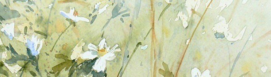
I think this poem is nice to make a poster even before I read it thoroughly. That’s because the total length of the poem and the length of each line are short. When I looked at the poetry posters models online, I found that many of the posters chose quite long poems, which make me unwilling to read carefully. The purpose of poetry posters is to combine the art of poetry with other elements, rather than to simply pile texts together with glaring images or other things. So in my opinion, short poems are more suitable than long ones because they are easier to be properly arranged. And I found it even better for a poster because its theme is about love. Love is the eternal theme for all kinds of art, that is to say this poem has a very large range of readers. If the poem is made to be a poster, it has a large population of audience, anyone with has experienced love and waiting could be its audience. And it can evoke resonance within the poem and its audience and within the audience. I decide to use pictures of imageries in the poem, such as a woman, a plant, not limiting to a tree, but something growing lonely but tough, and images connected with heartbroken, disappointment, waiting, and longing for love. I think it’s a good idea to focus on the last stanza and emphasize the words “here” which have already been emphasized in the original poem since this part is the climax and essence of the poem. Other parts might be in smaller font size, but also need deliberate dispose. This poem is highly emotional-sensitive, so every detail should be handled carefully and designed beautifully.
“Poetry Poster” – Review of Models
1. http://www.broadsidedpress.org/bsides/2009/50-Origins.pdf
This one is the one I consider the best. At the first glance, the picture grabbed my attention. The pattern of growth rings is captivating and makes me want to see more about the poster. The poem on it is short and is arranged in short lines and is left justified. This arrangement makes the poem look neat and tidy. And the typeface for most part of the poem is Garamond, which is easy to read and not too formal, perfectly fit the style of the poem. And there is another thing worth mentioning. There is a leading word or phrase in every two stanzas. I don’t know if they belong to the original poem, but they fit well in the overall layout. They each takes a separate line and is in the middle of that line. And all of the leading words and phrases are italics. All these efforts dedicate to emphasizing these words. I found that if we connect these phrases together, it appears to look like a person, who looks forward to the future, keeps saying yes. It brings a sense of romance and combining with the whole poem, the overall feeling is great. Now look back to the picture. In the poem, the author mentioned words about the olive tree several times, so the choose of growth rings is quite corresponding with the poem’s theme. The rare brown in the picture imitates the color of trunk, also adds a sense of steady and deep. The title of the poem has background color of brown, which is the same as the one in the picture. This layout makes the entirety harmonious. Generally speaking, this poster is a outstanding one of simple style.
2. http://poeticjourneys.uconn.edu/gallery2010-2011.php#10
This poster is the one I consider the weakest. I feel uncomfortable at the first glance I see it. The composer might try to create strong contrast. However, the black background color and the white texts make the poem hard to read. And the font size is way too small, which made the texts even harder to be recognized. Actually, the only part that I can read is the one on the right side of the poster, “Like the skull of a king, I am white with the fear of it”, because it is much bigger. However, even this part is not that easy to read because it’s all in uppercase. The sentence is too long for uppercases. The composer could have used other means to emphasis this part of the poem, such as using a decorative typefaces, using bold, and using “small caps” indicated in WOVENText, which is a combination of usual capital letter and small capital letters. On the aspect of arrangement, I think it is weird to right justified. Most readers are used to left justified texts. Plus the strong contrast between the background and text, the unusual overall layout creates an awkward feeling. At the bottom part of the texts, there are three lines on the right of the right justified texts. Although I admit that the design of dislocation is creative and nice, it creates confusion of the reading sequence. I usually think appropriate blanks benefits the layout of works. However, in this poster, the texts are not placed very appropriate, the orderly margin at the right of the main body makes the blank meaningless and boring. This poster would be much better if it is revised carefully.
“First Recitation” Reflection
- In the first recitation, the poem I chose is Japan by Billy Collins. This poem was a spirit-orientated poem, by which I mean that it needed deeper comprehension, appreciation and imagination. It was also beautiful and peaceful. So I decided to use a piece of music as the background. Coincidentally, the poem mentioned piano, thus I picked a smoothing piano solo. Since the inspiration of the poem is the author’s favorite haiku, I printed the haiku out, making paper tapes and passed them out to everyone so that my audience could have some background of the poem and comprehend the author’s emotion in the poem. I recited the poem in a soft voice and slow pace. The second stanza made an analogy between the feeling of reciting the poem and the feeling of eating a perfect grape again and again. Even if it was easy to understand, the audience needed time to imagine and appreciate. So I made my pace particularly slow here. When I said, “I tap out its rhythm on an empty shelf”, I tapped lightly on the floor. And I looked down at the floor to imitate the movement of the author when it came to “when the dog looks up at me, I kneel down on the floor”. I fastened my pace a little bit when I recited the middle part of the poem until the last two stanzas. I considered the last two stanzas the most beautiful part of the whole poem, so I paused several times during this part to allow my audience had sufficient time enjoying it. I also made very nice eye contact with my audience. I looked in their eyes and tempted to pour my comprehension to the poem and emotion to them. However, I still had some defects. This was a morning recitation and many people were sleepy at that time. My pace might be too slow to arouse attention to my recitation. And at first, I was so nervous that I forgot my words and caused an awkward pause. When I rehearsed, my pace fitted the tempo of the music so that the climax of the poem is anastomotic with that of the music. However, I failed to do so during the recitation. Although the music was gentle and its climax was not so obvious, the miss of pace influenced the overall quality of recitation.
