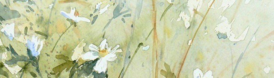
1. http://www.broadsidedpress.org/bsides/2009/50-Origins.pdf
This one is the one I consider the best. At the first glance, the picture grabbed my attention. The pattern of growth rings is captivating and makes me want to see more about the poster. The poem on it is short and is arranged in short lines and is left justified. This arrangement makes the poem look neat and tidy. And the typeface for most part of the poem is Garamond, which is easy to read and not too formal, perfectly fit the style of the poem. And there is another thing worth mentioning. There is a leading word or phrase in every two stanzas. I don’t know if they belong to the original poem, but they fit well in the overall layout. They each takes a separate line and is in the middle of that line. And all of the leading words and phrases are italics. All these efforts dedicate to emphasizing these words. I found that if we connect these phrases together, it appears to look like a person, who looks forward to the future, keeps saying yes. It brings a sense of romance and combining with the whole poem, the overall feeling is great. Now look back to the picture. In the poem, the author mentioned words about the olive tree several times, so the choose of growth rings is quite corresponding with the poem’s theme. The rare brown in the picture imitates the color of trunk, also adds a sense of steady and deep. The title of the poem has background color of brown, which is the same as the one in the picture. This layout makes the entirety harmonious. Generally speaking, this poster is a outstanding one of simple style.
2. http://poeticjourneys.uconn.edu/gallery2010-2011.php#10
This poster is the one I consider the weakest. I feel uncomfortable at the first glance I see it. The composer might try to create strong contrast. However, the black background color and the white texts make the poem hard to read. And the font size is way too small, which made the texts even harder to be recognized. Actually, the only part that I can read is the one on the right side of the poster, “Like the skull of a king, I am white with the fear of it”, because it is much bigger. However, even this part is not that easy to read because it’s all in uppercase. The sentence is too long for uppercases. The composer could have used other means to emphasis this part of the poem, such as using a decorative typefaces, using bold, and using “small caps” indicated in WOVENText, which is a combination of usual capital letter and small capital letters. On the aspect of arrangement, I think it is weird to right justified. Most readers are used to left justified texts. Plus the strong contrast between the background and text, the unusual overall layout creates an awkward feeling. At the bottom part of the texts, there are three lines on the right of the right justified texts. Although I admit that the design of dislocation is creative and nice, it creates confusion of the reading sequence. I usually think appropriate blanks benefits the layout of works. However, in this poster, the texts are not placed very appropriate, the orderly margin at the right of the main body makes the blank meaningless and boring. This poster would be much better if it is revised carefully.
